Japandi Paint Colours
Japandi blends Japanese and Scandinavian ideas: simplicity, natural materials and a warm, grounded palette. Think creamy walls, taupe and greige, with charcoal or earthy accents and plenty of pale timber. Every shade is available as a 60ml sample.
Japandi colour is warm and quiet. Creams, taupes and greiges make a calm backdrop for pale oak, linen and stoneware, and deeper charcoals or earthy browns add grounding accents. It suits minimal, uncluttered rooms where materials do the talking.
At a glance
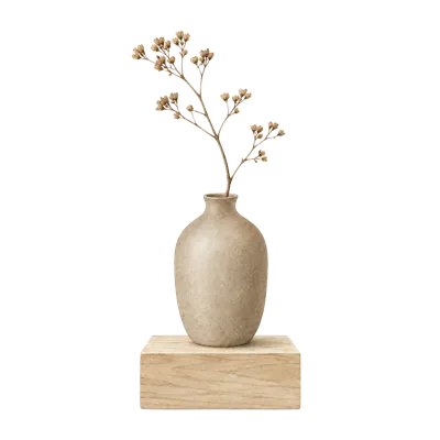
- Start here
- Warm and minimal. Japandi colour is quiet and natural. Start with a warm cream or taupe, then add one deeper accent.
- North light
- Warm taupes and creams. Warm taupes and creams. Cool north light suits warm taupes and creams, which stay soft rather than grey.
- South light
- Greiges and soft greys. Greiges and soft greys. Warm daylight suits cooler greiges, which stay calm rather than cold.
- East light
- Warm neutrals for later. Warm neutrals for later. Warm neutrals balance cooler afternoon light.
- West light
- Earthy accents for evenings. Earthy accents for evenings. Warm evening light makes taupes and earthy accents glow.
- Pairs with
- Oak, linen and stoneware. Japandi colour is a backdrop for natural materials: pale oak, linen, paper lamps and handmade ceramics.
- Woodwork
- Tone it with the walls. Painting woodwork the same warm neutral as the walls keeps the room calm and uncluttered.
- Sample tip
- Check every change of light. Move your sample between walls. Check it in morning and afternoon daylight, then under the lights you use at night.
Tap any tile to read more.
Warm creams and soft whites
Gentle creams for a calm, minimal backdrop.
Best in north-, south-, east- and west-facing rooms
A warm cream is the quiet foundation of a Japandi room. It feels soft beside pale timber and linen.
Coco™, Lawrence™ and Milled™ suit any direction; Dolly™ and Dahnya™ suit north-, east- and west-facing rooms.
Taupe and greige
Grounded neutrals for quiet, natural rooms.
Best in north-, south-, east- and west-facing rooms
Taupe and greige give a Japandi room warmth and depth without colour shouting. They sit beautifully with oak and stone.
Brinners™, Wynnie™ and Plough™ suit any direction. Maltster™, Pipistrelle™ and Gruit™ suit north-, east- and west-facing rooms; Peverel™ prefers south-, east- or west-facing light.
Charcoal and earthy accents
One deep accent to ground the room.
Best in north-, east- and west-facing rooms
A single deep accent, on a wall, a door or a piece of furniture, grounds a Japandi scheme.
Whimgin™ and Albion™ suit north-, east- and west-facing rooms; Arvicola™ suits north-facing rooms; Leadbelt™ and Skipper™ prefer east- or west-facing light.
Sample it the way we would
Step 1
Paint your peel-and-sticks
Each £5.99 sample comes with three paintable peel-and-sticks. Give them two coats and let them dry fully.
Step 2
Stick them around the room
Put them on two or three walls, including the wall opposite the window, at eye level and lower down.
Step 3
Live with them for a day or two
Look in the morning, the afternoon and under your evening lamps. Move them around until you are sure.
Your questions, answered
What are Japandi colours?
Warm, grounded neutrals: creams, taupes and greiges, with charcoal or earthy brown accents and plenty of natural timber.
Is Japandi the same as Scandi?
Not quite. Scandi palettes are cooler and brighter; Japandi is warmer and more grounded, with deeper accents.
Should Japandi walls be white?
Usually a warm cream or taupe works better than a stark white, because it feels softer beside natural materials.
Keep exploring
Taupe Paint
Grey and brown together, with a quiet warmth all of its own.
Greige & Mushroom Paint
The neutral for people who find grey too cold and beige too yellow.
Neutral Paint Colours
Quiet colours that are never as simple as they look.
Calming Paint Colours
Soft, muted and light. The colours research links with feeling relaxed.