At a glance
- Kelvin is the colour of the light; CRI is how truthfully that light shows other colours
- CRI is a score out of 100: the closer to 100, the closer colours look to how they should
- Bulbs sold in the UK must normally be CRI 80 or above, and the box must say what it is
- For choosing and living with paint colours, look for CRI 90 or above
- R9, the score for strong red, is not in the headline figure: worth checking for reds and pinks
If you have bought bulbs recently you will know kelvin: around 2700K for a warm, golden light, 4000K for a crisp, cool one. Kelvin describes the colour of the light itself, the bit you notice when you look at the bulb.
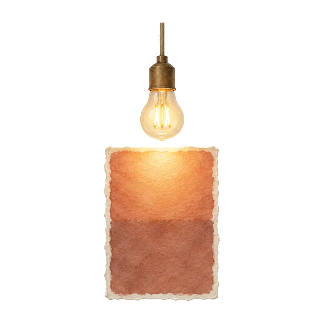
CRI, the colour rendering index, answers a different question: once that light lands on your walls, your sofa and your skin, how truthfully does it show their colours? In the Energy Saving Trust’s words, some bulbs might distort colours compared with how they would look under natural light, and the CRI shows how accurately a bulb will light other colours.
The two are independent. A warm 2700K bulb can render colours very well, and a cool daylight bulb can render them poorly. So every bulb gives you two choices: the colour of light you want (kelvin) and how faithfully you want your colours shown (CRI).
White light is really a blend of colours. A surface can only show a colour that is in the light falling on it: a leaf looks green in sunlight because sunlight contains green light for the leaf to reflect. Take that colour out of the light and the leaf looks dull or grey.
Daylight and old filament bulbs give out a smooth, continuous blend right across the rainbow. Many LEDs build their white from a less even blend, strong in some colours and thinner in others. Your eye still sees the light as white, but colours that rely on the thin parts look duller or slightly shifted.
That is why two bulbs that both say 2700K, and look exactly the same colour when switched on, can make the same wall look different. CRI is the number that tells them apart.
The method comes from the International Commission on Illumination (CIE), the international body for light and colour, based in Vienna. A set of standard test colours is measured under the bulb and under a reference light of the same colour temperature: for warm and neutral bulbs the reference glows like a filament, and for very cool bulbs it is a standard daylight.
Each test colour gets a score for how little it changes. The headline figure, written CRI or Ra, is the average for the first eight, all soft, muted colours: greyish red, greyish yellow, yellow-green, yellowish green, bluish green, light blue, light violet and reddish purple. A perfect 100 means none of them look any different from the reference.
Filament and halogen bulbs glow in the same way as the reference light, which is why they scored at or near 100. LEDs have to earn their score through the blend of colours they give out.
European lighting practice treats Ra 80 and above as good colour rendering and Ra 90 and above as very good. UK ecodesign rules, which match the EU’s, require bulbs to be at least CRI 80, apart from a few outdoor and industrial uses that must be clearly labelled. The Energy Saving Trust says 80 or more is good for most household tasks.
Where colour really matters, professionals go higher. The European standard for lighting indoor workplaces asks for at least Ra 80 for most indoor work, rising to Ra 90 for colour inspection. UK lighting designers note that most interior LED lighting is around Ra 80, with Ra 95 and above chosen for galleries and shops.
In a painted room, CRI 80 shows colours perfectly recognisably, but they can look a little flatter, and subtle differences between close neutrals, such as a greige and a taupe, are harder to judge. At 90 and above, colours and undertones come through much more faithfully.
Beyond the eight soft colours in the headline figure, the CIE method has extra, stronger test colours: R9 strong red, R10 strong yellow, R11 strong green, R12 strong blue, R13 a light yellowish pink close to skin, and R14 an olive leaf green. They are quoted separately, and R9 is the one lighting specialists watch most.
Because R9 is not part of the headline figure, a bulb can score well overall yet still make deep reds look dull. That matters for terracottas, burgundies, warm pinks and earthy reds, and for wood and skin tones. R9 is not required on UK packaging, so look for it on the maker’s datasheet: the higher the better.
Many of the colours people love most are subtle: muted greens, stones, greiges and soft pinks whose character lives in their undertone. Under low colour rendering those undertones are harder to read, and two quite different neutrals can look alike.
Lighting specialists draw a useful line between colour fidelity and colour preference. Where colours must be compared and small differences seen, as in paint manufacturing, high colour rendering is essential. At home in the evening, you may simply prefer a warm, cosy light in which colours do not look exactly as they do by day. Both are fine, but choose your paint under light that shows it honestly.
Colour rendering is also tied to metamerism, when two colours that match under one light look different under another. The more faithfully a bulb renders colour, the more what you see in the evening agrees with what you saw by day.
UK rules require bulb packaging to show the colour rendering index, rounded to a whole number, alongside the brightness in lumens and the colour temperature in kelvin. It may read “CRI 90”, “Ra 90” or “Ra > 90”.
Specialist bulbs often carry a three-digit code instead. The first digit is the CRI band and the last two are the colour temperature in hundreds of kelvin, so 927 means CRI 90 or more at 2700K, and 830 means CRI in the 80s at 3000K.
CRI does not tell you how warm or cool a bulb is (that is kelvin) or how bright it is (that is lumens). It tells you how much colours differ from the reference, not which way: two bulbs with the same CRI can make colours look slightly richer or slightly duller.
The CIE has since developed a more accurate score, the colour fidelity index (Rf), which uses 99 test colours drawn from real objects and reads the same way, up to 100. In 2025 the CIE recommended that it gradually replace CRI in regulations and standards, with both quoted side by side during the changeover. For now you will mostly see Rf on professional datasheets.
Hold your painted samples, and something strongly red such as a book cover or a tea towel, under the bulb in the evening. Look again by a window the next morning. If the colours look noticeably duller or flatter under the bulb, its colour rendering is probably holding them back.
If you are choosing between bulbs, fit two in neighbouring lamps and compare the same samples under each. The difference between CRI 80 and CRI 90 is often easiest to see on reds, skin and close neutrals.
Reading CRI on a bulb box
| You might see | What it means |
|---|---|
| CRI 80, Ra 80 or Ra > 80 | Good colour rendering, and the UK minimum for most household bulbs |
| CRI 90, Ra 90 or Ra > 90 | Very good colour rendering: colours and undertones show more faithfully |
| 827 or 830 | CRI in the 80s, at 2700K or 3000K |
| 927 or 930 | CRI of 90 or above, at 2700K or 3000K |
| R9 | The score for strong red; higher is better |
| Rf | The CIE’s newer colour fidelity score, read like CRI: higher is better |
Your questions, answered
What is the difference between CRI and kelvin?
Kelvin is the colour of the light itself, from warm and golden to cool and blue. CRI is how truthfully that light shows the colours around it. They are independent, so choose both.
What CRI should I choose for a living room?
For seeing paint colours well, CRI 90 or above, in a warm white (2700 to 3000K) for relaxing rooms.
Is CRI 80 bad?
No. It is classed as good colour rendering and is the UK minimum for most household bulbs. Colours can look a little flatter, and close neutrals are harder to tell apart.
Do I need CRI 95 or above at home?
Not usually. CRI 90 and above is classed as very good colour rendering, which is plenty for living with paint colours. CRI 95 and above is typically chosen for galleries and shops.
Does a higher CRI make light warmer or cooler?
No. CRI is about colour accuracy only. Warmth and coolness come from the colour temperature, in kelvin.