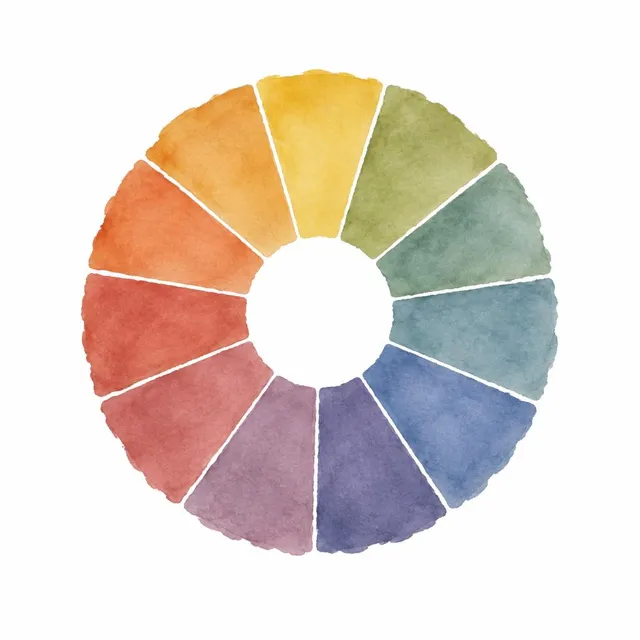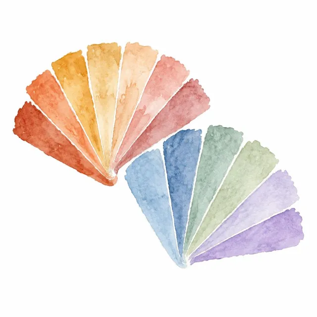
Colours are grouped by the temperature they suggest. Reds, oranges and yellows read warm, and colour professionals associate them with energy, comfort and sociability. Blues, greens and violets read cool, and are associated with calm and rest. That split is the oldest idea in decorating with colour, and it is useful, but on its own it is too blunt for real paint.
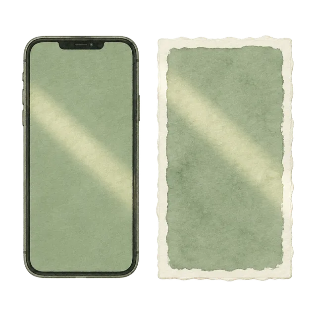
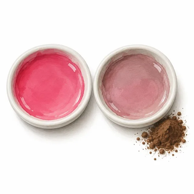
Temperature is relative. A green can be warm, leaning towards yellow, or cool, leaning towards blue. Greys, whites and neutrals carry a temperature too, through their undertone: a grey with a hint of yellow or red reads warm, one with blue or green reads cool. The easiest way to see it is to put two samples side by side, or next to a pure white sheet of paper, where the lean becomes obvious. Light then shifts everything. Warm lamps make warm colours richer and cool colours duller, while cooler light flatters cool colours and can wash out warm ones.
Use temperature to work with your light rather than against it. North-facing rooms get cool, even light, so warm colours, or neutrals with warm undertones, stop them feeling cold. South-facing rooms get strong warm light, so cool colours can balance them, though almost anything works. East- and west-facing rooms change through the day, so check samples morning and evening. Your bulbs matter too: a warm-white lamp around 2700K will warm everything in the evening. Most balanced rooms mix the two, a warm wall with cool accents or the reverse, so the scheme does not feel one-note.
Warm and cool are tendencies, not fixed labels. Always judge a colour’s temperature beside its neighbours and in your own daylight and lamp light.